Grid Systems, Responsive Behavior, and Compartmentalization
- Chris Wallace
- Mon Jan 30 2017
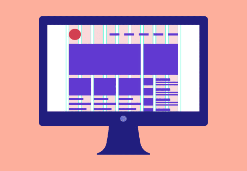
Whilst I’m currently in the domain of React development, I figured this week I should do something (slightly) lighter and write about my experience with Grid Systems. I recently watched this fantastic video around designing (when you’re not a designer) https://www.youtube.com/watch?v=lsPrhA_m6ss and it sparked off me returning to ‘the grid’.
Grids are marvelous code contraptions, a good grid has complex calculation, but then simplifies layout management immensely. I think any front-end developer has had frustration with floats and columns (fortunately those days are coming to an end with flexbox becoming more prominent, but we’re not out the woods just yet!). But Grids are a classic story of becoming abused all too quickly.
First, let’s define what a Grid is
- A Grid is a definition of columns
- It’s a common artifact shared between web developer and web designer (the designer designs to it, the developer develops to it).
- It controls spacing and layout of components at a high level with a degree of control
- It eases the pains of component alignment to help achieve the dream of ‘pixel perfect’
- It helps generalize when layout breaks for responsive design
Now, let’s define what a Grid isn’t
- A Grid doesn’t dictate all spacing and layout.
- It’s not some magical witchcraft for creating native columns in the browser (it’s reusable classes/styling rules composed together to achieve ‘the column effect’)
- A Grid is not for the benefit of development only. If something’s been designed with a Grid in mind, then it makes sense to introduce columns.
- It’s not an excuse to skip learning floats/flexbox/position/display/tables/widths/media queries. These beautiful properties have their powers (and cryptonites) so should be learned without a library.
How did Grids become popular?
I think from the boom in front-end frameworks like bootstap and zurb there was a sudden urgency that any ‘file -> new project’ requires a grid from the off to achieve ‘responsive design’. These frameworks do grids very well, but some bad habits got picked up along the way (“who’s for div soup?!”)
Grids themselves don’t fix responsive design, they fix adaptive design. This page explains the difference between responsive/adaptive/fluid/fixed better than I could, but all you need to know is that Grid systems have set columns between major breakpoints (common popular device widths are good starter, but really they should be based on user device usage).
But that’s where grids end. To achieve ‘responsive design’ you need more tweaking (more on this later).
When is time to ‘Grid it’?
When is it time to install and use a Grid system? My best advice on Grid Systems is to use it when it becomes a design decision. In general if design has used a Grid to help group content, then it makes sense that the code uses the same system. Otherwise stick with good ‘ol padding and margins on a case-by-case basis.
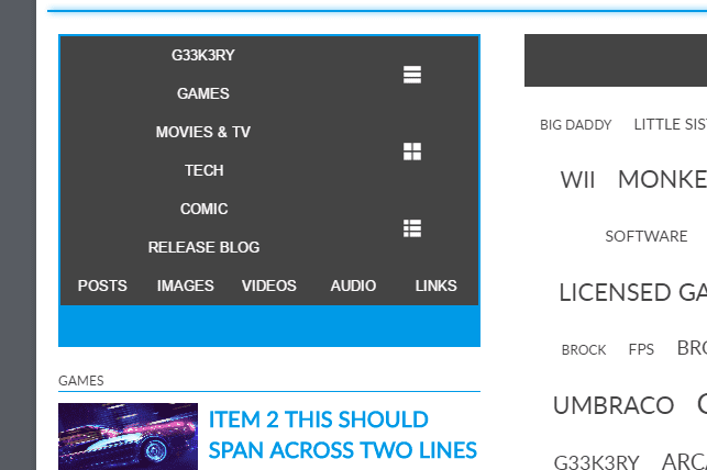
Before I knew about Grid Systems, I was given a design to build that was not too dissimilar to the one below.
I asked my colleague what the intention behind the columns were and they explained grid systems (for which I’m very thankful!). I remember asking ‘are we using a grid system in our code?’, this question was then asked around the team…an hour later we dropped everything and starting discussing grids.
Basically the moral of this story is, if your designer has used a Grid, it’s probably worth considering (and agreeing one with design).
Choose your Grid wisely
Grid system implementations are ten-a-penny. But not all Grids are the same (and I’m not talking about how many columns each one implement). One difference I see in Grids is approach towards wrapping and rows.
Some Grids (like bootstrap) promote a ‘one row of columns’ approach (with a containing ‘row’ element). Whereas others follow a ‘masonry’ approach. The key difference between these two approaches is guttering (the start and end columns may have gutters on the outside or not). Some systems (like lost http://lostgrid.org/) allow for both techniques. Personally I like the masonry approach of every column having equal gutters either side (until you’re on mobile where every pixel of space is precious!).
My point is that before deciding on a grid, you need to prototype and experiment to decide which is best for purpose (according to the design defined).
Not everything lives in the Grid
I repeat. Not everything lives in the Grid! When I first started playing with Grid systems I did something really stupid and tried to Grid all the things. I tried putting far too many components within the boundaries of the marked columns and ultimately shot myself in the foot when having to build responsively.
It helps to have 2 or 3 versions of a design at different widths to identify what areas of the UI (aka components) sit perfectly inside grid columns. Grids themselves usually have less columns on small devices, so it helps to identify how many columns your content spans during design. Here’s the same design as above but with groupings highlighted in green. Note that elements are only put into the grid where it makes visual sense at a relatively high level.
Spacing and layout is only controlled so much with a Grid. If you abuse your system to try and control the lowest degree of layout complexity (we’re talking buttons and paragraphs) you ultimately end up with…
Nested Grids
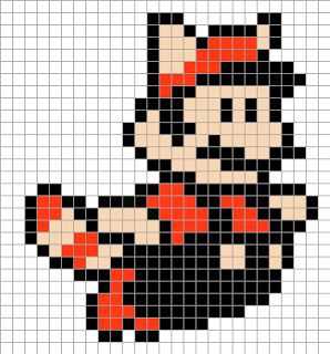
Nesting Grids is nasty business, and adds too much complexity to your layout (a column which itself has 12 columns which then has 12 columns is nuts!). Always remember that Grids help simplify widths (‘component is x columns wide’ rather than ‘component is x pixels wide’). The more columns you nest the more artificially ‘blocky’ your UI becomes. We’re not trying to create a matrix like an 8 – bit videogame, we’re just trying to introduce some ‘compartmentalization’.
Grids are compartmentalization
If you don’t remember anything else then remember this! Grid columns are ‘the walls’ of your components existence! This image below conveys is well, your content is like water held in a container or compartment.
When developing a component, imagine that it’s 100% wide all the time. What controls the space of that component is the compartment it lives in (aka a column).
Imagine Han Solo in a trash compactor…
He and his metal pole take up all the space, and our trash compactor (aka column) helps control that space. Once you start leveraging your Grid in this way, suddenly you have some structure and order. You can build sections in isolation of each other, and not concern yourself with ‘how wide’ your component needs to be.
I like to think of compartmentalization like a set of shelves (here’s the shelf of the angry videogame nerd).
Note that all the consoles and games are free to exist and take up as much space within the realms of their shelf. But it’s the shelf that controls the layout of this impressive gaming collection! (including cable management…) Remember the grid system isn’t all that different from a set of shelves. You can code chaos to your hearts content…and your columns keep the chaos compartmentalized.
Of course if you’re thinking responsive, there’s one last element to this…
Responsive design? Better start tweaking!
Like I said earlier, Grids don’t fix responsive design problems. They just isolate problems a bit better.
Imagine Indiana Jones getting crushed by the ceiling in the temple of doom…
Unless he wants to get impaled immediately, at some point he’s going to have to break from standing to sitting. The same goes for our components! Here’s my component, it lives inside of 8/12 of my Grid columns.
Eventually it will occupy 8/8 columns thanks to my global breakpoints…
But in between these two breakpoints my component would meet the fate of brave Indy above and get crush to the point it’s cramped and unusable..
This is where tweakpoints come in handy! A ‘tweakpoint’ is simply a custom media query which orders content to change layout outside of global breakpoints/grid column changes. With a few tweakpoints my component makes use of the space available, making it usable for those devices with rare viewport widths.
It’s not great, but it does make my UI usable regardless of device! By leveraging ‘tweakpoints’ your UI becomes truly responsive. But as you can see, a Grid alone cannot accomplish this.
And thus concludes my experience with Grid systems. Grids are great and I’d rather have them than not, just remember they come with further understanding of controlling layout in order to utilize them effectively in your UI!

Harrison if you’re reading this I apologise …but you do play a lot of characters that nearly end up getting squashed…just saying.

